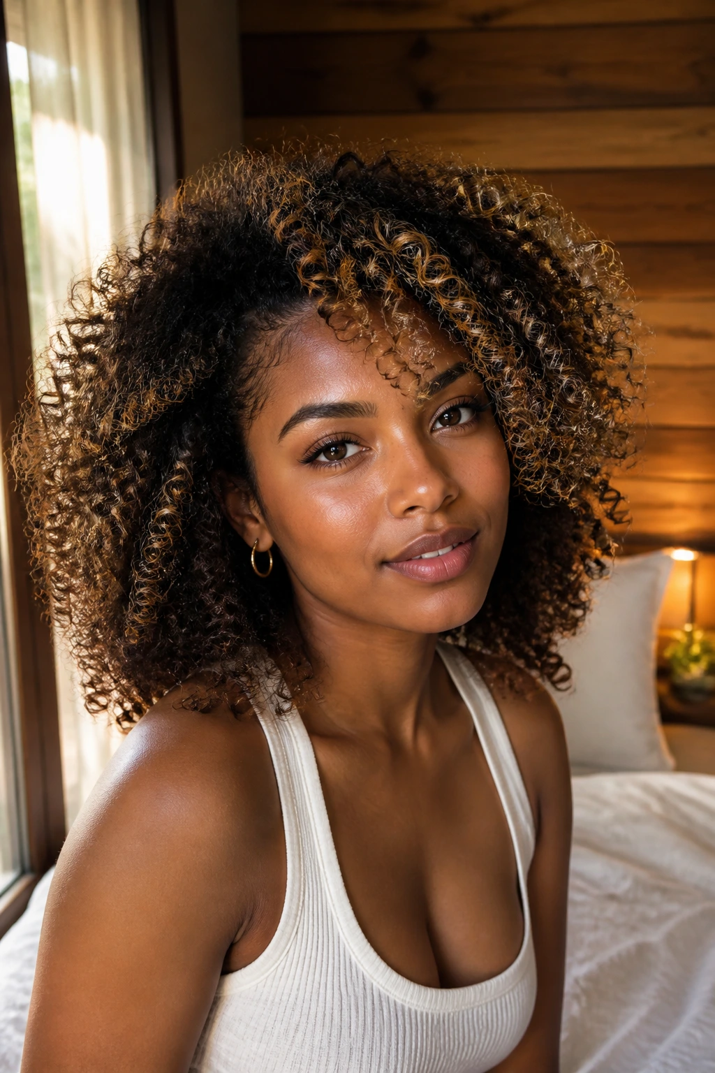
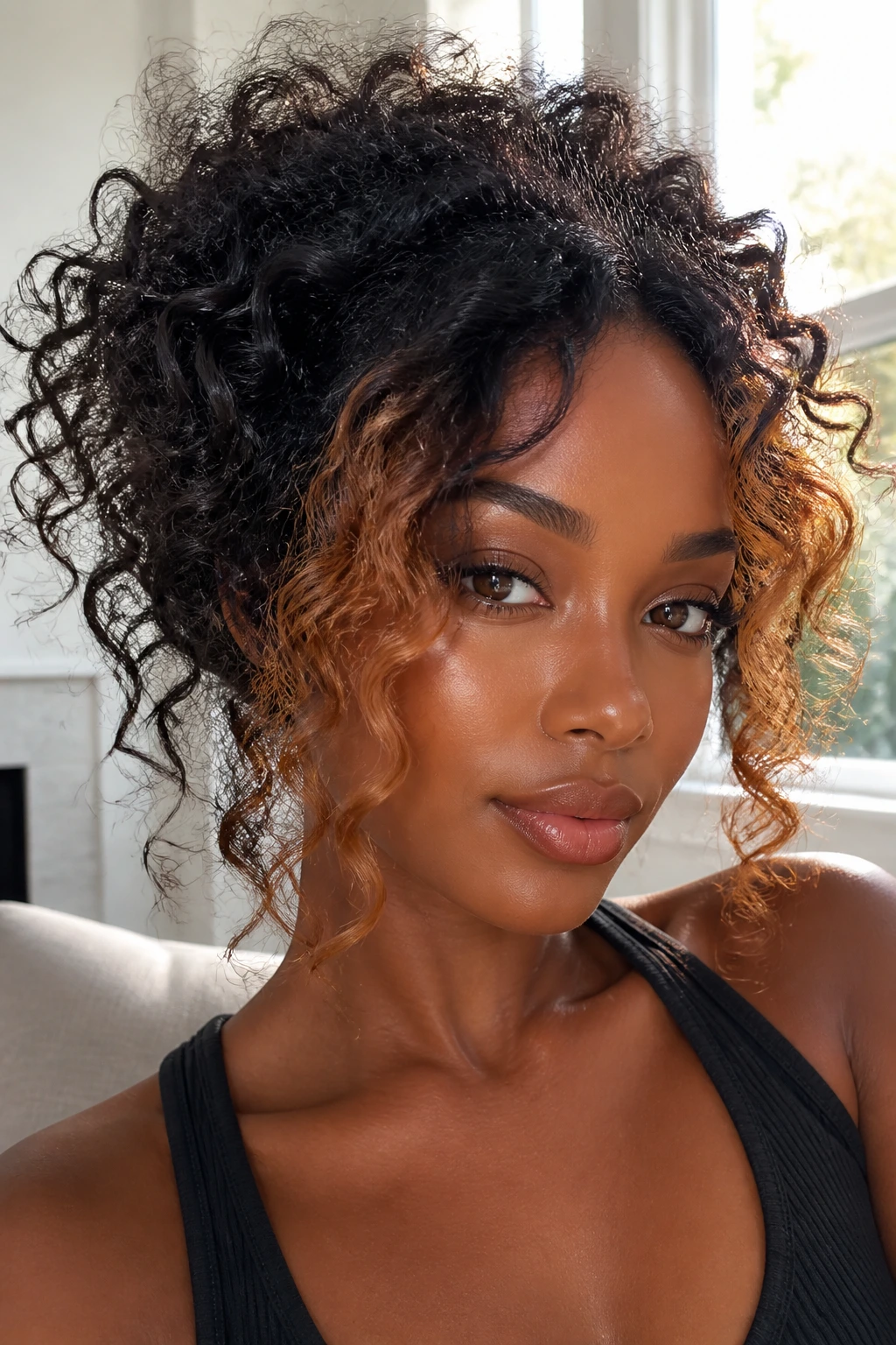
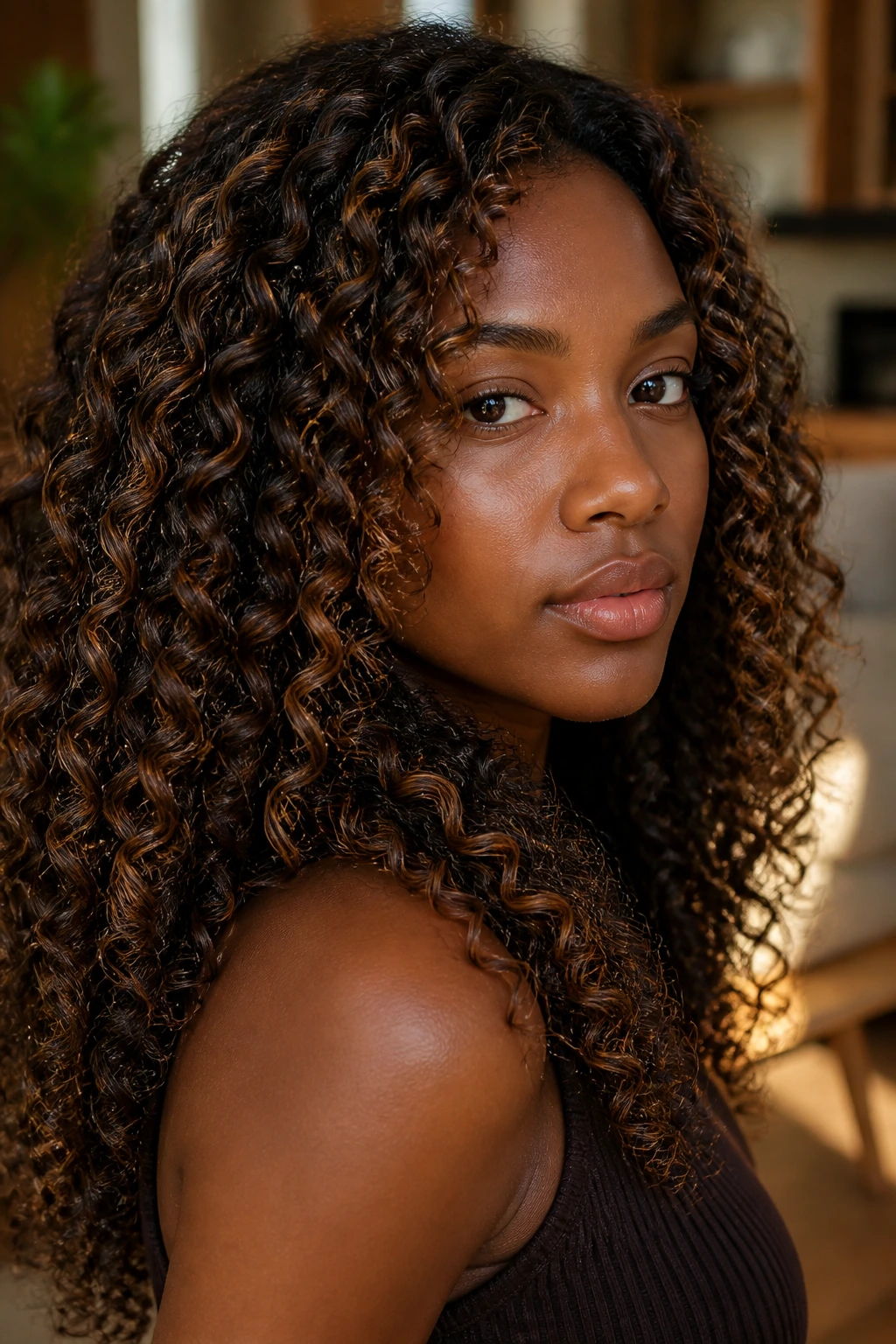
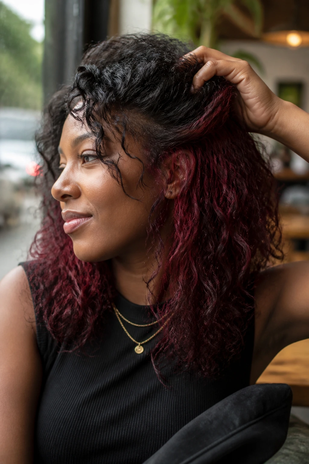
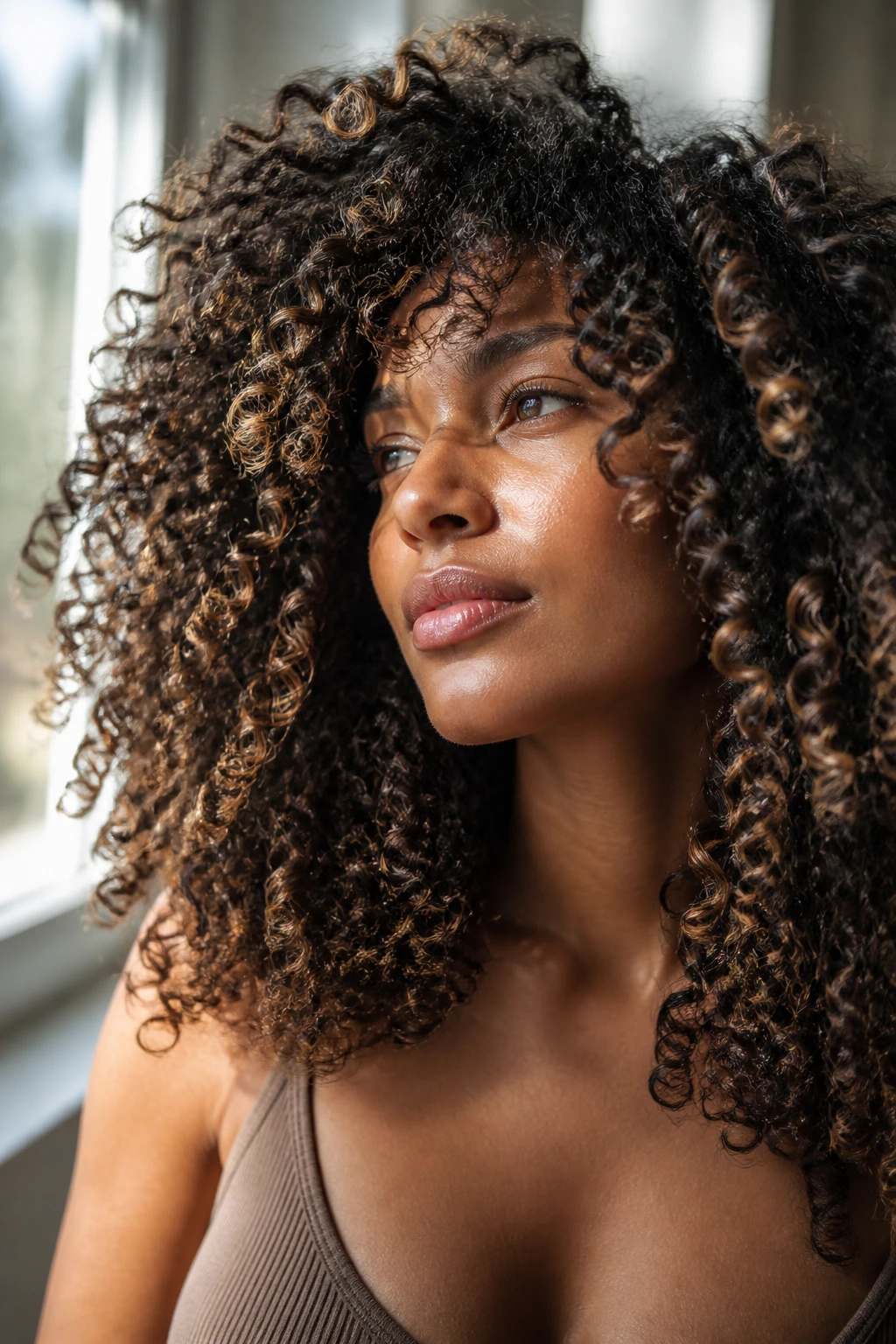
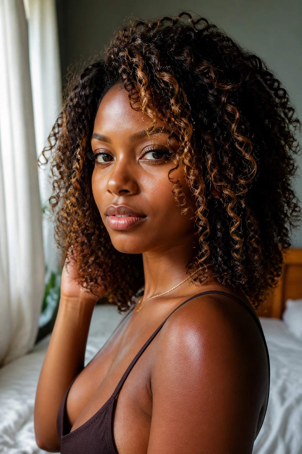
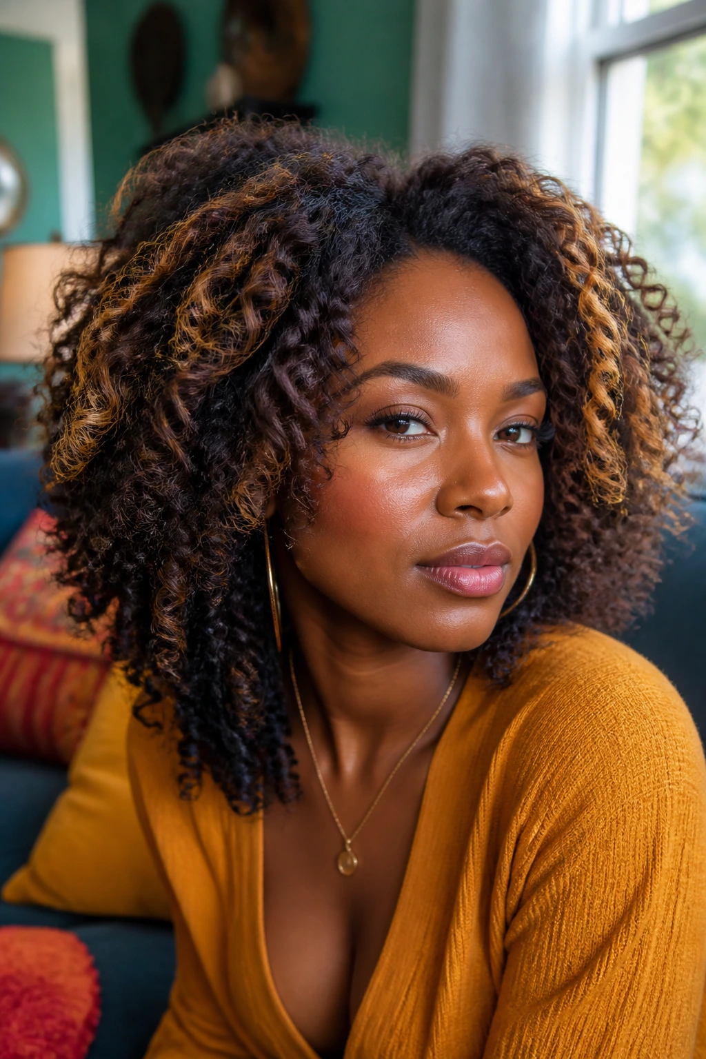
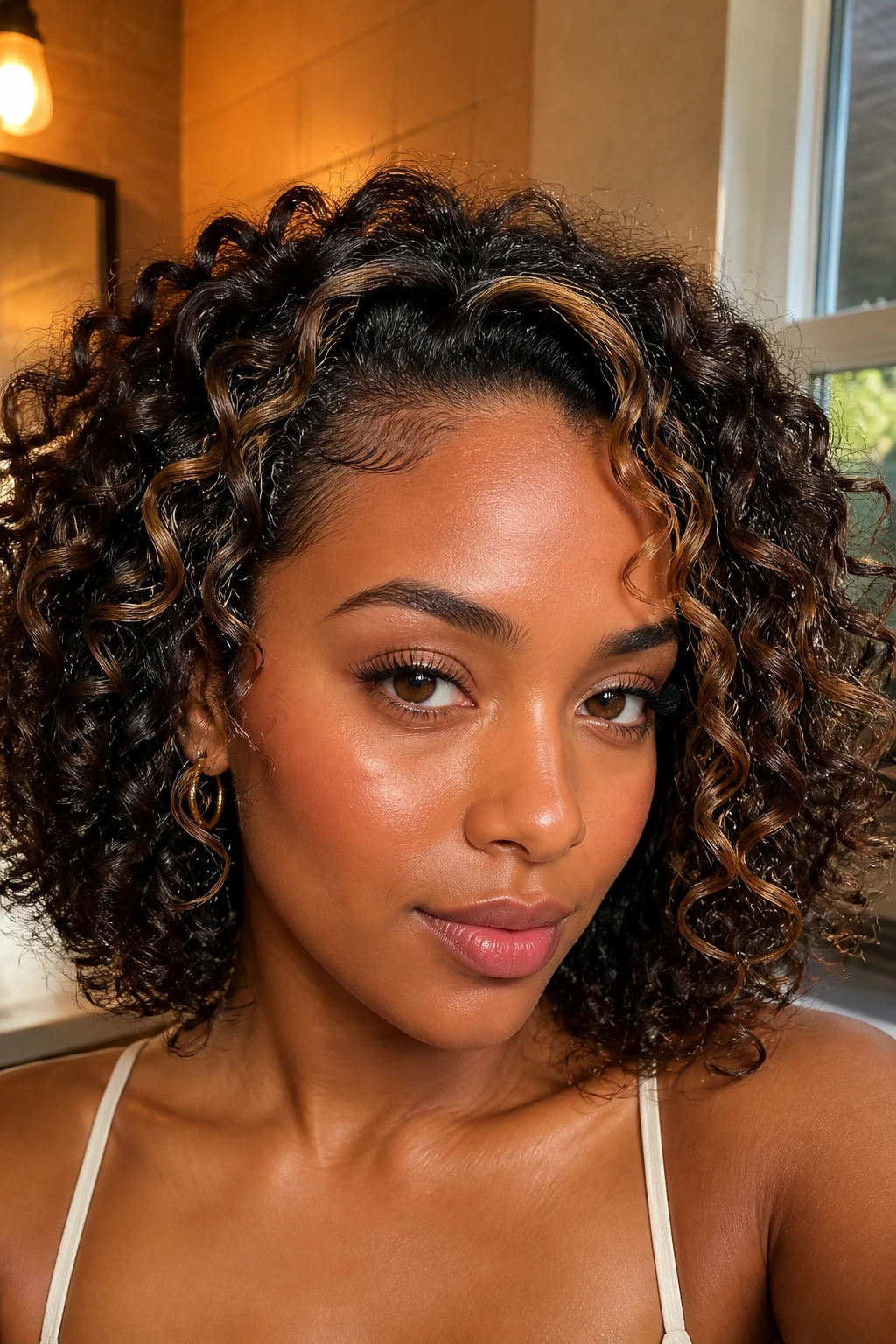
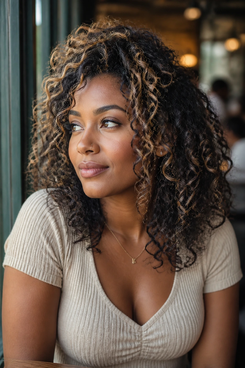
Curly hair doesn’t hide color; it breaks it into flashes. On deep skin, that can look rich and dimensional, or flat and stripy, and the difference usually comes down to tone, placement, and how much lift the hair can handle.
A pale blonde that looks clean on a swatch chart can read harsh against warm brown skin, while caramel, copper, bronze, burgundy, plum, and jewel tones tend to sit into the curl pattern like they belong there. And curls change the whole conversation anyway. A highlight that barely shows on wet hair can jump out once the coil dries and shrinks, so the same shade can behave in two different ways before lunch.
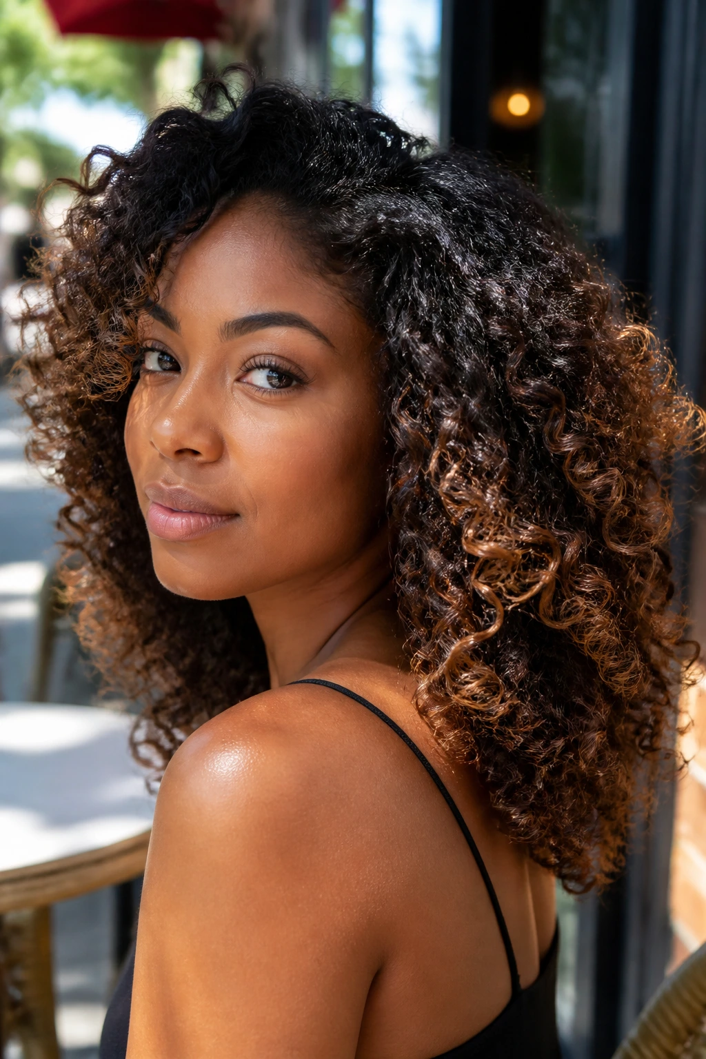
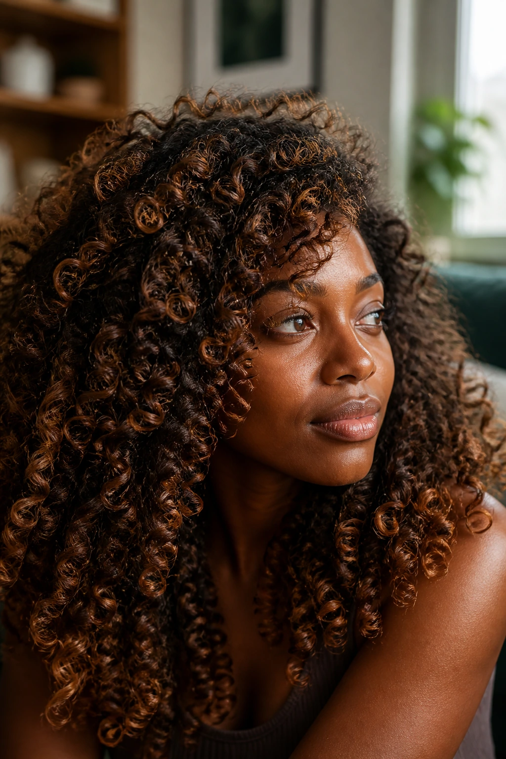
That’s why highlight color matters so much here. The curl pattern isn’t just texture; it’s the frame. Paint the color too wide and you get chunky stripes. Keep the ribbons narrow and place them where the curl bends outward, and you get movement instead of blocks. The shades below lean into that movement, with a mix of soft, wearable tones and a few bolder ones for people who want their hair to announce itself from across the room.
Why These Shades Earn Their Place
- Curl-first placement: Each color is chosen with coils, spirals, and twists in mind, so the highlight can show up even when shrinkage kicks in.
- Deep-skin respect: These shades sit well beside melanin-rich skin because they bring either warmth, depth, or clean contrast instead of chalky pallor.
- Salon-friendly language: You can take these ideas to a colorist without speaking in vague inspiration words and hoping for the best.
- Low-drama options included: Some of these looks grow out softly and only need glossing, not constant bleaching.
- Bold shades, handled smartly: The vivid colors are placed as panels, ribbons, or peekaboo sections so they look intentional, not fried.
- Built for real life: A wash-and-go, twist-out, puff, or stretched blowout can all show these colors differently, which is part of the fun.
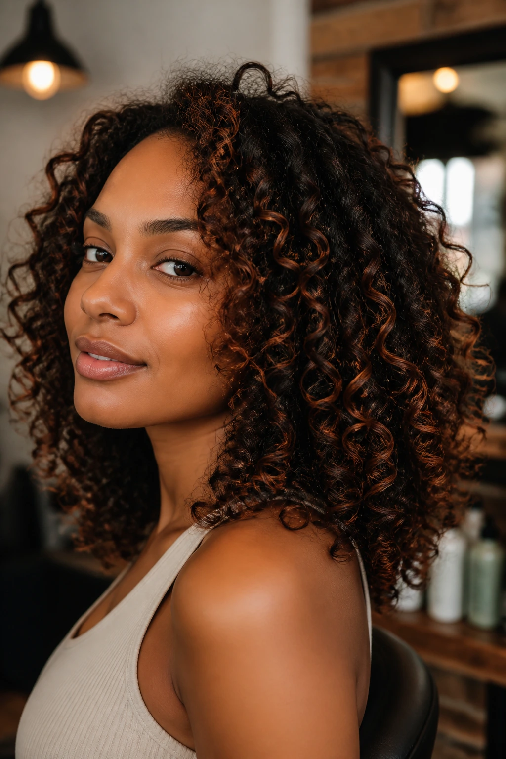
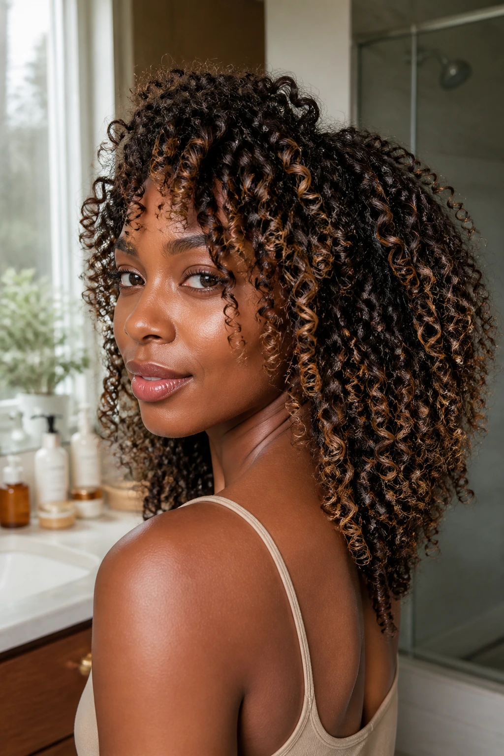
1. Warm Caramel Ribbons
Warm caramel is the safe bet that never looks dull. On deep skin, it reads like sunlight caught in the outer curve of each curl, especially when the ribbons stay thin and the base remains rich and dark. The effect is soft, not shy.
Why It Works on Curls
Caramel has enough gold in it to glow against brown skin, but not so much lift that it starts shouting over the curl pattern. It works best on level 4 to 6 bases, where the contrast feels deliberate without turning into zebra stripes. If your curls are tight, ask for narrow ribbons through the crown and along the front hairline.
A little root shadow helps, too. Without it, caramel can slide into a flat honey tone that loses depth by the second wash.
Best for: first-time highlights, medium-to-tight curls, and anyone who wants warmth without a full blonde commitment.
Salon wording: “Soft caramel ribbons, kept fine, with a deeper root near the scalp.”
Watch for: chunky foils that sit too wide on the curl clump.
My take: this is the look I’d hand to someone nervous but not boring.
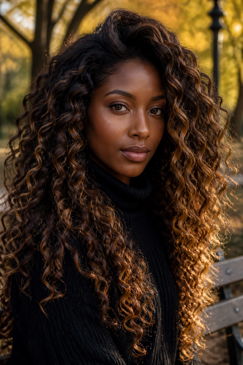
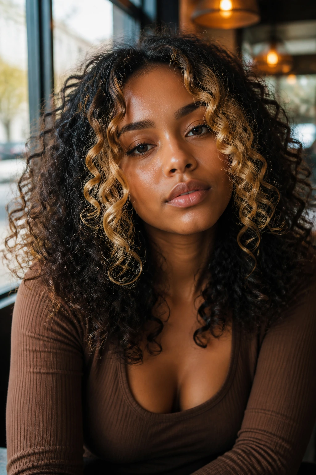
2. Bronze Honey Balayage
Bronze honey is what happens when warmth gets a little richer and more reflective. It’s less sugary than straight honey blonde, more grounded than caramel, and on deep skin it usually reads as glow instead of glare.
The shape matters here. A freehand balayage sweep lets the bronze land on the outer layer of the curls, where the light hits first. That’s the part people see when you turn your head. If the lightening is done too evenly from root to tip, the whole look can flatten out and feel generic.
For curl patterns with loose bends or big coils, this color gives movement without asking for aggressive bleaching. It also grows out with less fuss than a brighter blonde. I like it most on people who wear their hair stretched on some days and shrunken on others, because the shade still shows up in both states.
3. Copper Penny Threads
Copper penny threads are louder than caramel and warmer than bronze. They have that shiny, metallic red-orange cast that looks electric against deep skin when the tone is kept clean and the placement stays fine.
Is copper risky? A little. But the risk is worth it when the undertone is right. Warm and neutral skin usually loves it, especially if your natural base already has some red in it. On curly hair, the color reads in flashes, not as one solid block, so even a bright copper can look wearable if it’s painted through the bends instead of packed into the whole head.
What to Ask For
Ask for thin copper ribbons with a soft gloss finish, not a flat orange lift. If your hair is very dark, the colorist may need to pre-lighten first, then tone it toward copper rather than brass. Brass is the enemy here. Copper is the point.
This shade looks especially good when the curls are defined with a little shine cream. Dry, fuzzy copper loses its charm fast.
4. Cinnamon Bronze Highlights
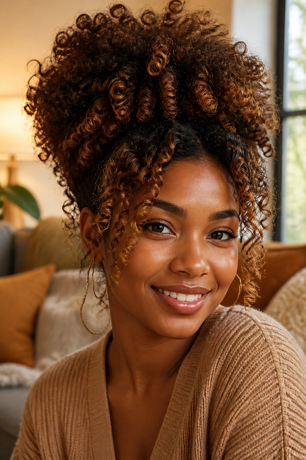
Cinnamon bronze sits between red-brown and gold-brown, which is exactly why it works so well on deep complexions. It brings warmth, but not the kind that turns muddy or neon under indoor light.
The shade has more spice than caramel and less flash than copper. That balance makes it a smart pick for people who want dimension that still looks polished when the curls are pulled into a pineapple puff or half-up style. A few cinnamon ribbons around the face can warm up the whole complexion in a way that feels almost automatic.
This one also plays nicely with thicker curl clusters. The shade catches on the edges of the coil and leaves the center darker, so the hair keeps its shape. That matters. Curly hair does not need to be flooded with color to look rich.
If you like low-effort color that still looks thought through, this is one of the better choices on the board.
5. Amber Face-Frame Pieces
Amber face-frame pieces are the highlight equivalent of a bright smile. They sit close to the face, where they can lift the whole look without requiring a full-head commitment, and the amber tone brings a buttery gold that flatters deep skin beautifully when it’s not over-lightened.
What makes this one useful is control. You can keep the rest of the hair dark and concentrated, then place the amber only where the curls fall around the cheekbones and jaw. On a curly bob, that can be enough. On longer coils, it reads like a spotlight rather than a full show.
If you part your hair in different places, ask for the pieces to be painted with movement in mind, not just the center part. Otherwise the color might vanish when you switch styles. I like this look for anyone testing the water before doing something bigger. It’s a small change with a lot of payoff.
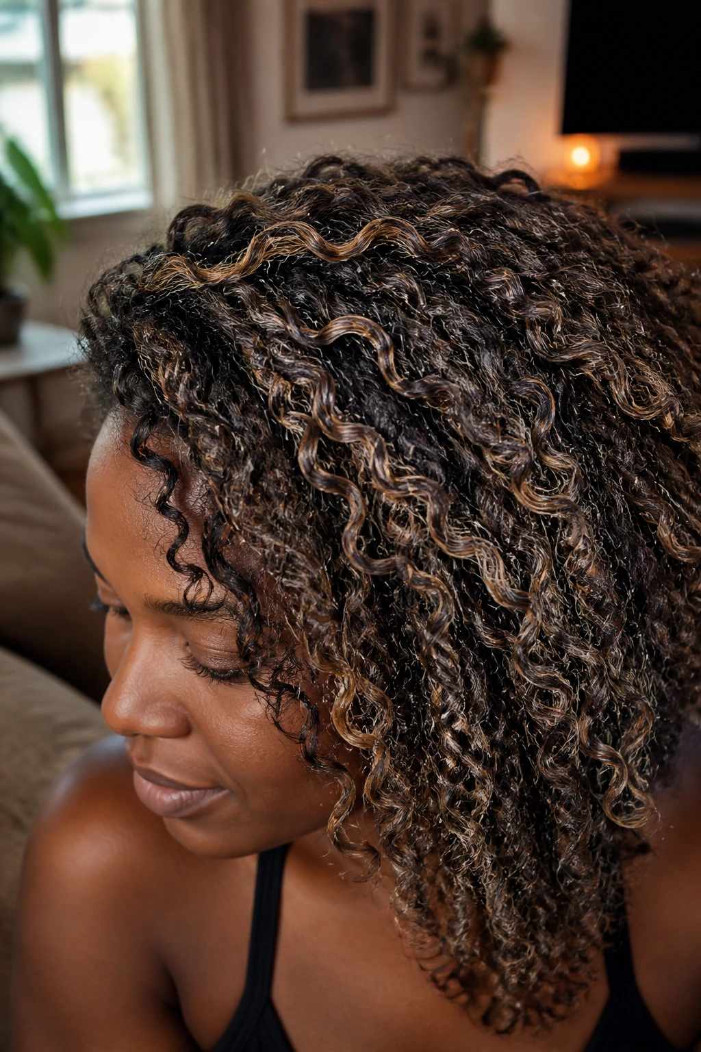
6. Toffee Ribbon Lights
Toffee ribbon lights are deeper and richer than caramel, which is why they look especially good on dark brown bases that need dimension more than brightness. The effect is subtle until the sun hits it, then the hair gives off that soft, sweet warmth without turning into a honey halo.
This is the color I’d choose for someone who wants their curls to look more expensive, if we’re being blunt. Not louder. Just more finished. The ribbons should stay narrow and slightly uneven so the hair doesn’t look lined up like a color chart.
Toffee also behaves nicely on twist-outs and braid-outs because the texture helps separate the ribbons naturally. If your curl pattern is tight, the color may hide a little in the interior and pop more on the outer layer. Good. That’s part of the charm. Not every highlight needs to shout from the roots.
7. Chestnut Gold Veils
Chestnut gold veils are softer than blonde and cooler than straight caramel. The blend of brown and gold gives deep skin a very easy glow, especially when the base color is a rich espresso or chocolate brown.
This look works because it doesn’t fight the natural darkness. It sits on top of it. That’s a small difference in wording, but a big difference on the head. When highlights are painted as veils instead of strips, the hair keeps its fullness. The curls still look thick, which matters a lot on coarse or dense textures.
I like chestnut gold most on medium-to-long curls, where the lighter strands can move a little as the hair shakes or stretches. On a short cut, you may want fewer, brighter pieces so the color doesn’t disappear into the shape. On a long one, the veils can be scattered through the top layers and nape for a softer grow-out.
8. Auburn Flame Ends
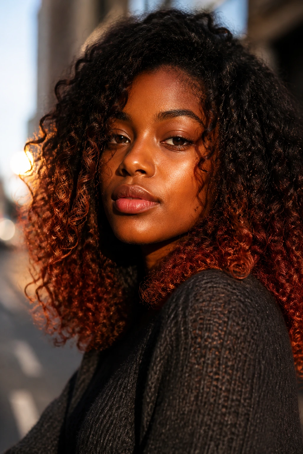
Auburn flame ends give the hair a warm ember effect, especially when the bottom third of the curls turns from brown to red-brown. The contrast is strong enough to be interesting, but not so bright that it fights deep skin.
The reason this works so well on curly hair is simple: ends move. Every time the curls bounce, the auburn catches light a little differently, which keeps the color from looking static. That matters more than people think. Straight hair can show color in one line; curls show it in motion.
This look is especially good if you wear twist-outs, wash-and-go styles, or stretched blowouts that let the ends separate. Ask for a softer root and let the flame show mostly at the tips. That way the grow-out looks intentional, not like a botched one-step dye job. I’d pick this over full-head red every single time for anyone who wants color with some breathing room.
9. Mahogany Glow
Mahogany glow is the quiet one in the group. It looks like a deep wine-brown sheen at first glance, then turns richer when the light moves. On deep skin, that low, saturated red-brown can look expensive in the best possible way.
This shade doesn’t need much lightening, which is a relief if your curls are already dry or fragile. Sometimes the smartest color move is the one that leaves the cuticle alone as much as possible. Mahogany gives you depth without requiring the hair to become a science project.
It also works for people who are tired of warm blonde ideas but still want dimension. The color shows up most clearly on the outer ringlets and at the crown. If the curls are very tight, the undertone can read almost like polished shine indoors and reveal the red-brown cast outside. That shift is nice. It keeps the hair from looking one-note.
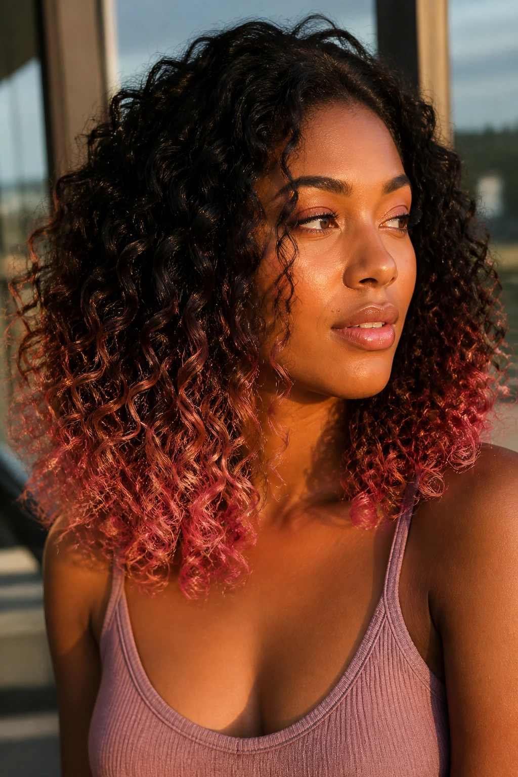
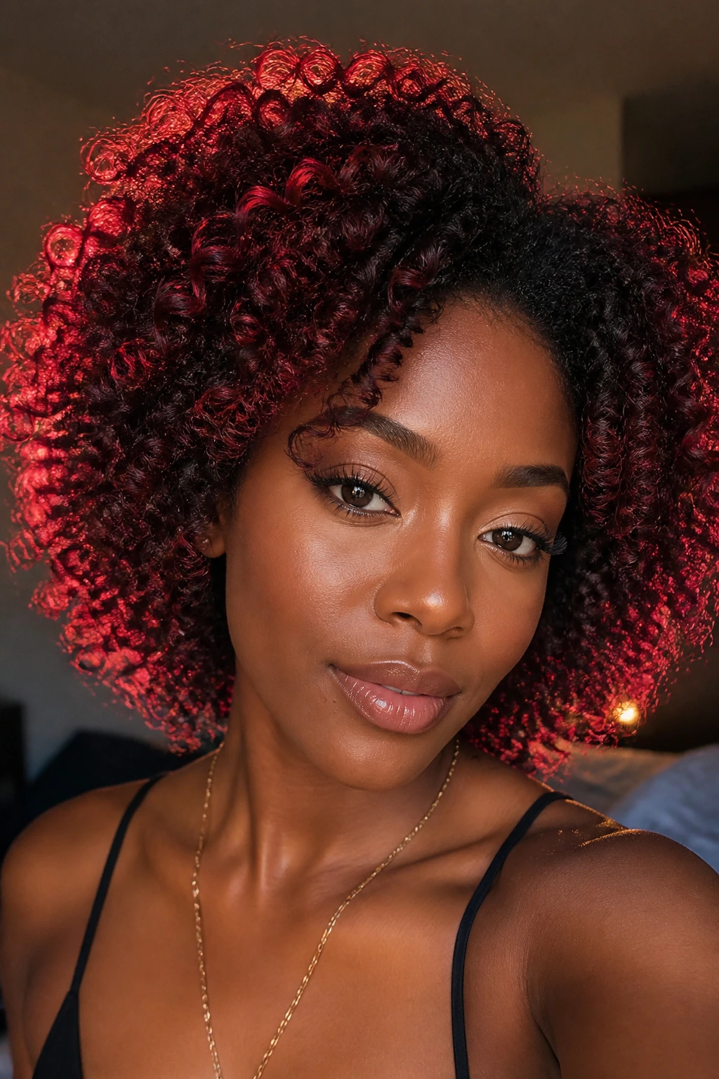
10. Cherry Cola Peekaboo
Cherry cola peekaboo highlights hide under the top layer and then flash red-violet when the curls move. It’s a playful look, but it’s also smart, because the deeper placement means the color can be dramatic without announcing itself at every angle.
I love this on curly hair because the texture naturally reveals and hides sections. A twist-out pulls the peekaboo pieces forward. A puff lets them disappear. A half-up style shows them off again. That built-in variation makes the color feel alive, not painted on.
How to Ask For It
Tell your colorist you want burgundy-red or cola-toned panels beneath the top layer, especially around the nape and under the crown. If you want more drama, place some pieces near the temple so they peek through when the hair shifts. If you want less maintenance, keep the vivid color farther underneath.
It’s one of the best choices for anyone who likes surprises in their style. Very little effort. Big payoff.
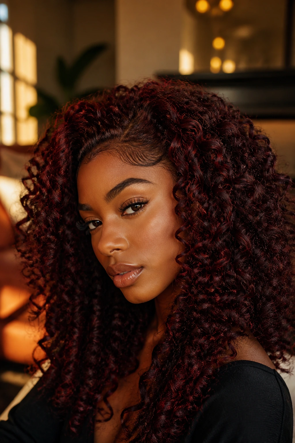
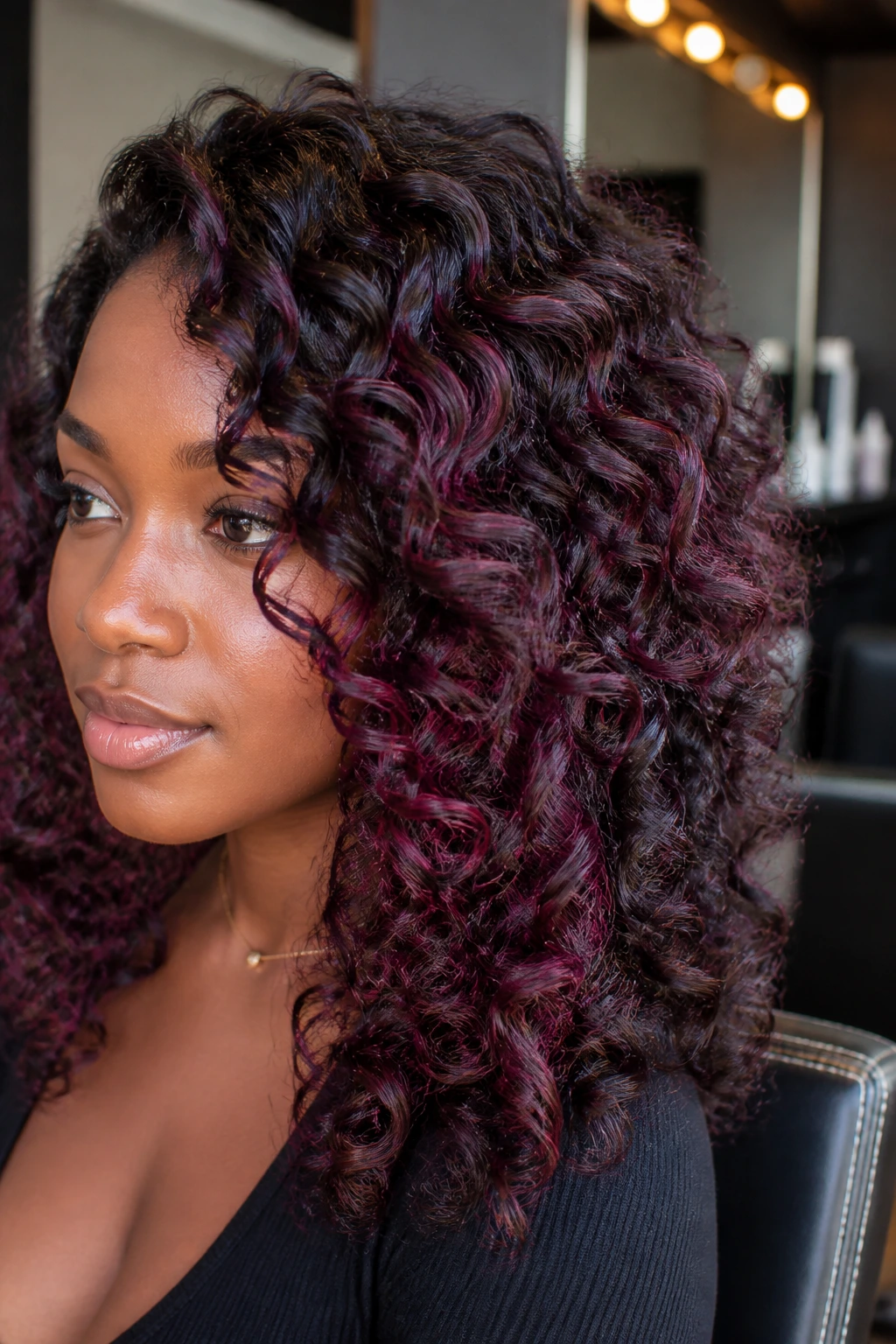
11. Burgundy Ribbon Highlights
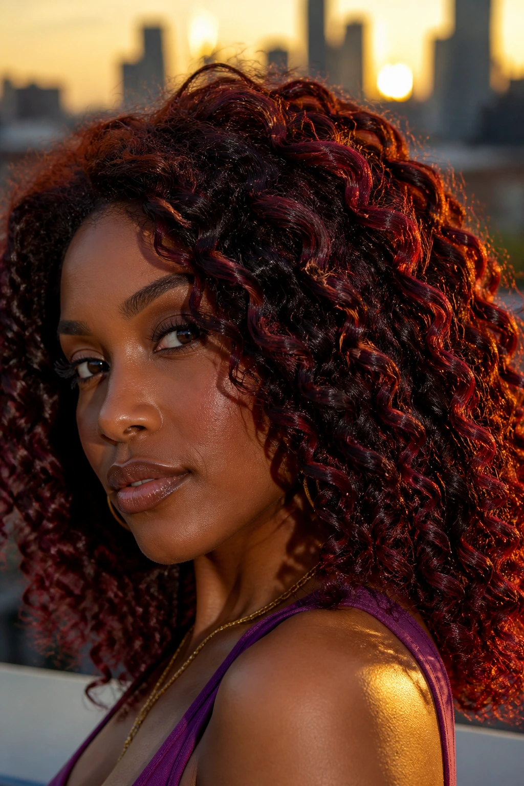
Burgundy ribbon highlights are richer and redder than mahogany, which means they bring more visible color without turning neon. On deep skin, burgundy can look lush and grounded at the same time, especially when the base remains dark and glossy.
The biggest mistake with burgundy is making it too thin and too faded. Then it can look brown under indoor light and vanish. Give it enough saturation to hold up against your complexion. Curls are forgiving, but they’re not magic. The color still needs depth.
This is a strong choice for medium or high-density curls because the ribbons can weave through the shape without making the hair look sparse. Add a curl cream with shine, and the color gets this wine-stain look that is better in real life than in photos. Bold in a calm way. That’s the sweet spot.
12. Mulberry Shine
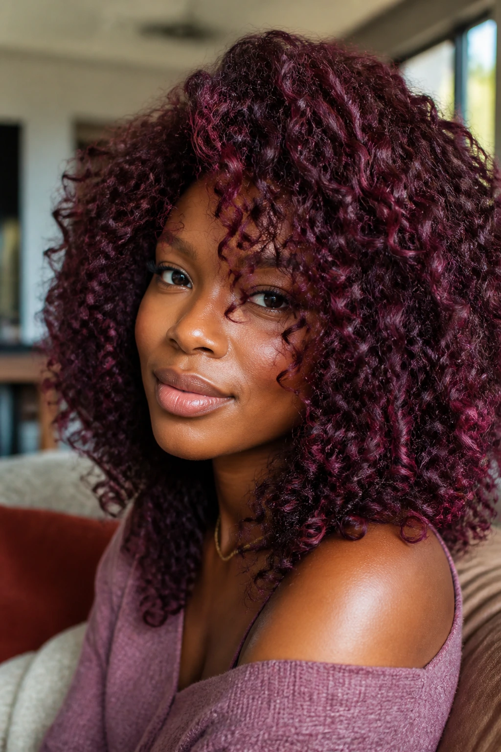
Mulberry shine sits between berry and purple, which gives it a fruit-dark richness that deep skin wears well. It’s cooler than burgundy, but not icy, so it feels more dimensional than a flat red-violet.
This shade is especially flattering if your complexion leans neutral or cool. On curls, mulberry shows up in the bends first, then deepens in the shadowed parts of the hair. That creates a very nice sense of depth. The color seems to travel through the pattern instead of sitting on top of it.
I’d use mulberry for someone who wants a fashion color but does not want the hair to read cartoonish. It’s a grown-up vivid shade. Not boring. Just disciplined. If the hair is pre-lightened too far, the purple side can take over and look bright; if that happens, a deeper gloss brings the berry back. Stay in the middle and it’s a beautiful place to be.
13. Plum Silk Highlights
Plum silk highlights have more coolness and less red than burgundy or mulberry. That makes them useful for deep skin with cooler undertones, especially when you want a shade that feels rich but not hot.
The silk part matters. Plum should move like fabric, not like marker ink. Ask for smoke in the formula, not flat violet. On curly hair, that smoky finish shows up well because the pattern creates natural highlights and shadows all on its own. The color doesn’t need help looking dimensional.
This look can be gorgeous on short coils, long ringlets, or blown-out curls. It’s one of the few cool tones that doesn’t automatically look harsh on deep complexions. Keep the roots dark and let the plum appear in ribbons, not panels. That restraint is what makes it read as polished. If the highlight is too bright, the color starts competing with the skin. Keep it soft and it stays elegant.
14. Violet Smoke
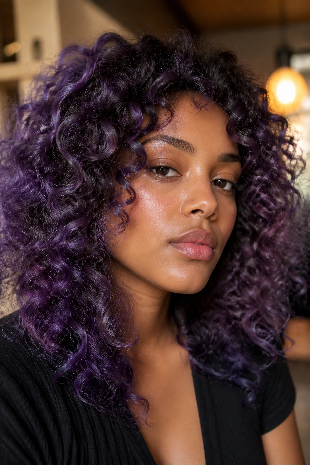
Violet smoke is for the person who wants something a little left of center. It has that moody purple depth that can look almost black in low light, then bloom into violet when sun or warm indoor lighting hits it.
This is where curly texture saves the day. On straight hair, a shade like this can look one-dimensional. On curls, each bend catches the purple differently, so the hair looks layered even when the actual color process was simple. If you’re nervous about fashion color, this is a smart entry point because the darkness keeps it wearable.
Best Placement
Ask for violet ribbon lights around the perimeter and crown, with a few deeper pieces left in the interior for contrast. That gives the color somewhere to hide and somewhere to show. It’s also kinder to the hair than trying to push a full-head bright violet from root to tip.
The look works best when the finish is glossy. Matte violet can look flat. Glossy violet looks deliberate.
15. Rose Gold Ends
Rose gold ends bring a softer, metallic warmth to the bottom half of the hair, and on deep skin they can look surprisingly clean if the pink is controlled and the gold is allowed to do some of the work. The danger is going too pastel. Don’t.
On curls, rose gold shows up best when the ends are slightly separated and the hair has movement. A wash-and-go gives a softer fade; a stretched braid-out gives the ends more surface area, so the metallic note reads better. I like this look more on medium-length hair than on long hair, simply because the fade is easier to read.
This is a high-maintenance choice. No pretending otherwise. Rose tones fade, and they fade faster than copper or caramel. Still, if you want a tender, polished look with a little edge, rose gold ends can be a good match for deep skin, especially with warm makeup or gold jewelry.
16. Champagne Beige Lights
Champagne beige lights are for people who want a lighter, cooler highlight without going all the way to icy blonde. On deep skin, the beige needs to be creamy, not dusty. That’s the difference between luminous and tired-looking.
This shade is tricky, and I’m not going to sugarcoat that. It usually needs a careful lift to around level 8 or 9, then a warm beige toner to keep it from looking gray. On curly hair, the color should be placed in ribbons, money pieces, or a few crown panels so it doesn’t overwhelm the whole head.
If your skin has warm undertones, a beige that’s too ash-heavy can drain the face. If that happens, ask for a little more gold in the toner. This is one of those looks that depends on restraint and clean toning more than bravado. Done well, it looks crisp and expensive. Done badly, it looks like the hair gave up.
17. Smoky Silver Streaks
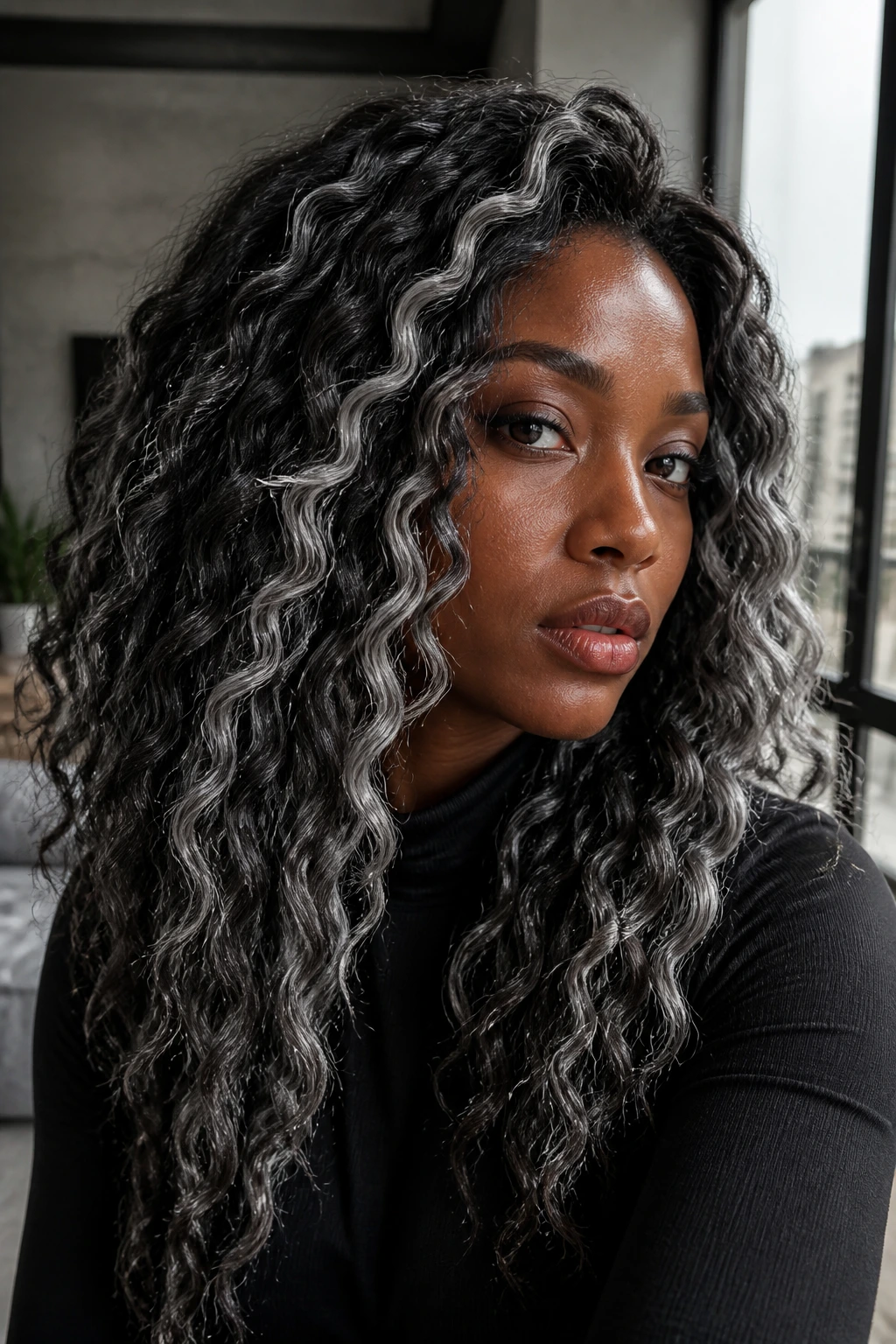
Smoky silver streaks give deep skin a sharp, high-contrast edge. They’re not white-blonde. They’re not gray in the granny sense either. They’re cool silver with depth, and the smoky tone keeps the look from turning harsh.
This color works best when the roots stay dark. The contrast is what makes the streaks interesting. On curly hair, silver ribbons can look especially good because the texture breaks up the shine into little flashes instead of one flat metallic slab. That keeps the look modern and less costume-like.
It’s not a low-maintenance move. Silver needs toner care, and porous hair can grab the wrong color fast. Still, if you want a cool-toned statement that feels more architectural than soft, this is one of the strongest options in the whole group. I’d choose it for someone who wears black, charcoal, white, or deep jewel tones and wants the hair to stand up to those clothes.
18. Sapphire Pop Panels
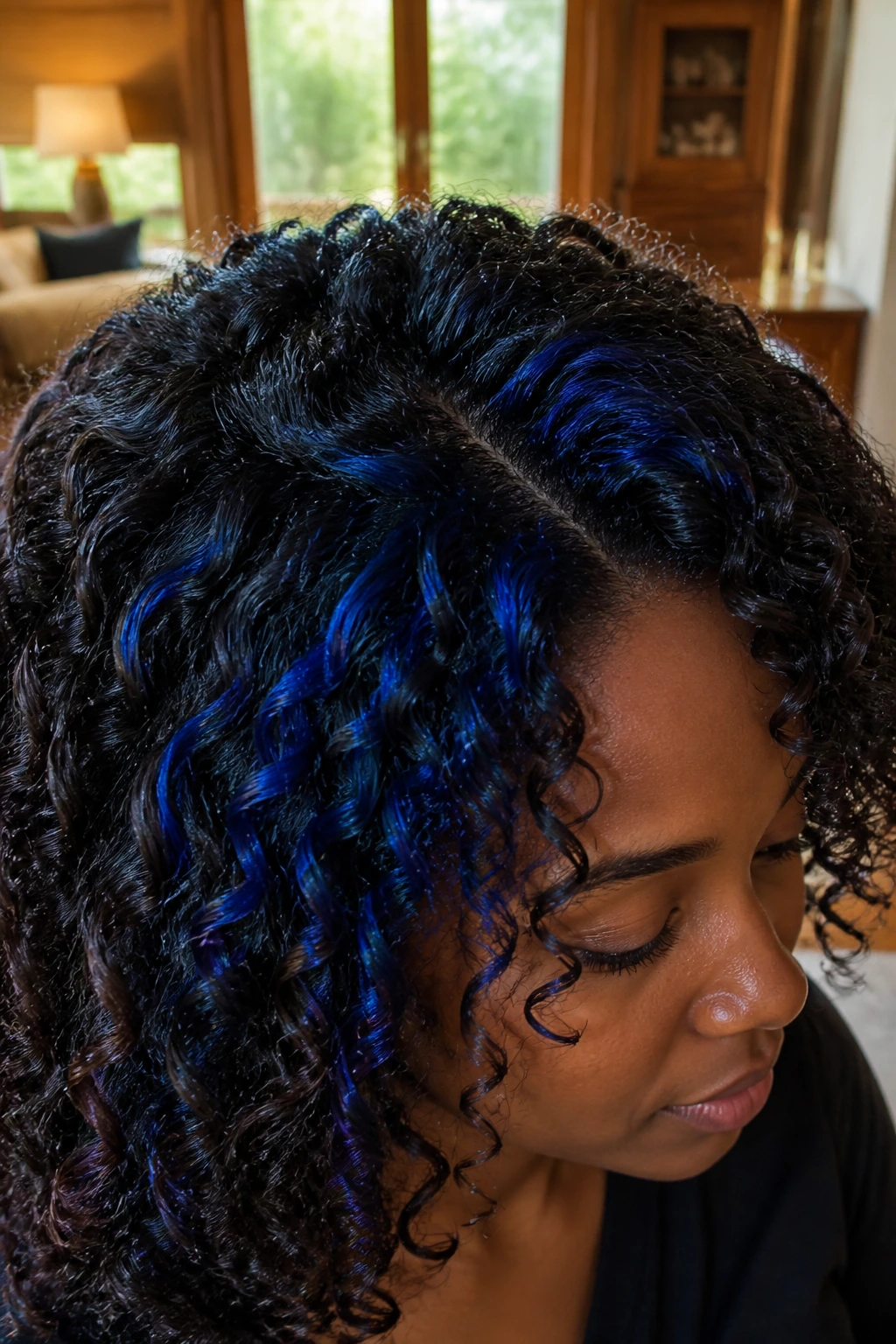
Sapphire pop panels are the kind of blue that looks expensive when it’s deep enough. On dark curly hair, sapphire can hide under the top layer and appear as flashes of blue-black in low light, then open up into true jewel blue when sunlight hits.
This is where placement saves the color. Put the sapphire where the curls separate naturally—around the crown, under the outer layer, or in a side panel—so the blue shows in movement instead of all at once. If every strand is the same brightness, the whole thing can feel flat. A little darkness inside the blue gives it depth.
This look needs lift, and it needs moisture. Blue shades are unforgiving on dry ends. The color itself is worth it, though, because sapphire on deep skin can look dramatic without needing to be neon. Think velvet, not marker ink. That’s the target.
19. Teal Underlights
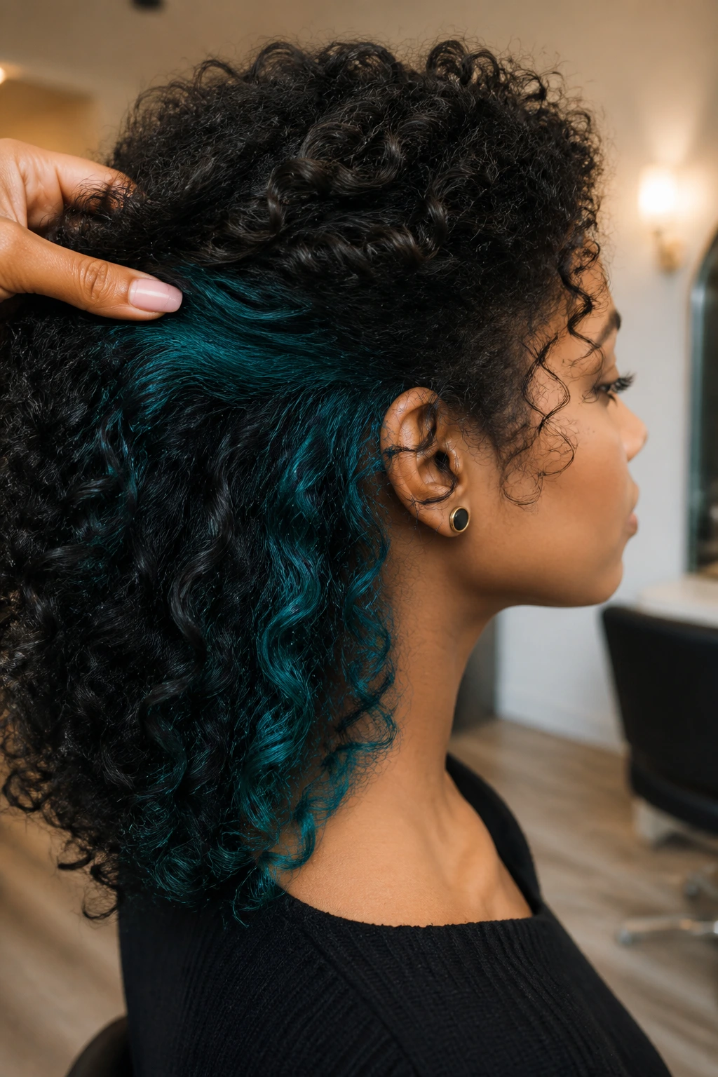
Teal underlights are one of my favorite ways to wear vivid color on curls because they stay hidden until the hair moves. The mix of blue and green reads richer than pure turquoise, and deep skin can carry that depth well.
This shade is especially useful for people who want a bold color but still need to show up in rooms where bright hair is not the whole story. You can tuck the teal under the crown, along the nape, or just behind the ears. Then it appears when the hair is pinned, twisted, or swept back.
Curly hair gives teal a nice advantage. The dark top layer protects the color a bit, while the curl pattern lets small sections peek through at random. That randomness is what makes the look feel alive. If you like color that doesn’t need to be front and center all day, this is a strong choice.
20. Emerald Accent Curls
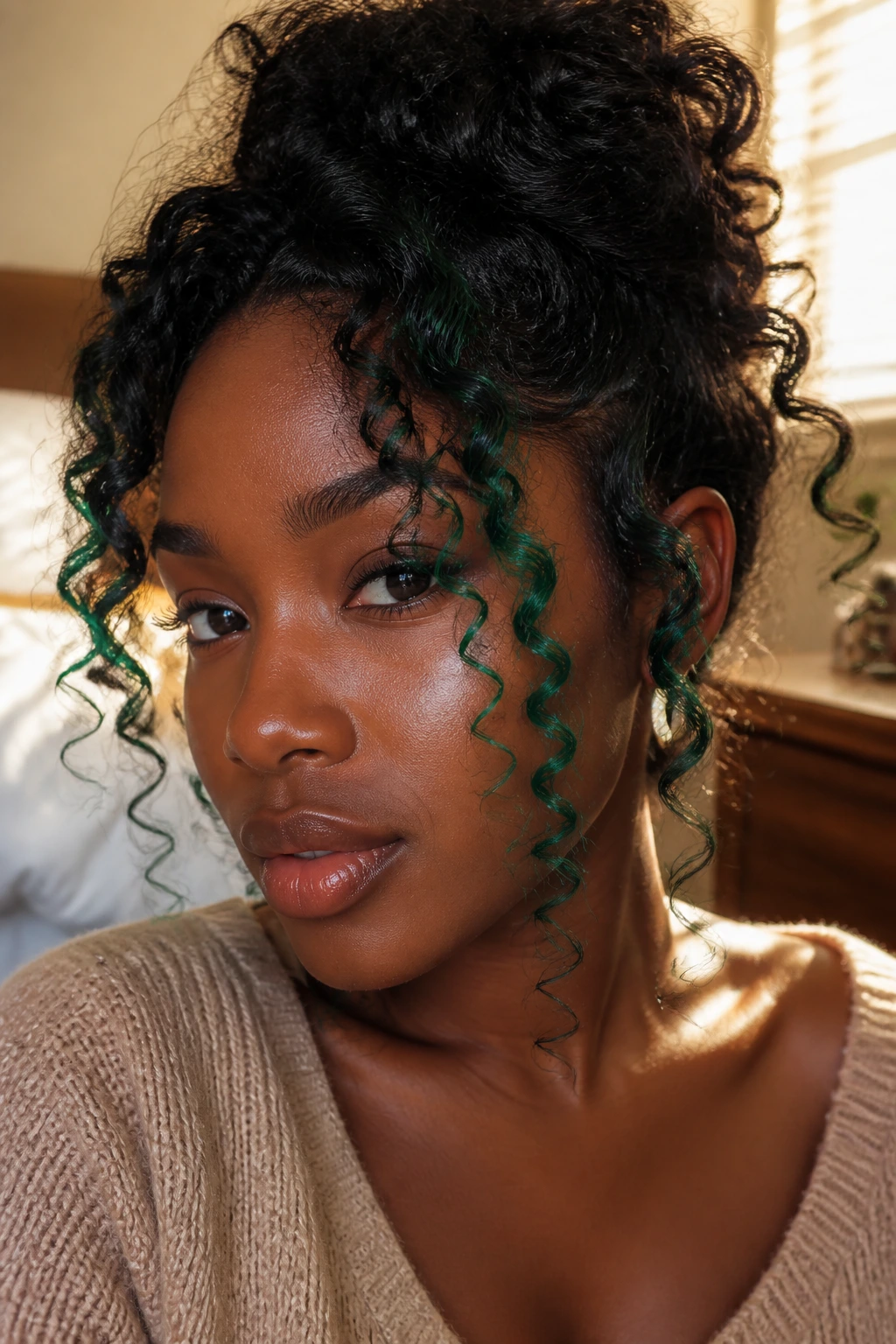
Emerald accent curls are lush, dark green highlights that can look almost jewel-like on deep skin when the tone stays saturated. The word “emerald” matters here. You want depth, not neon.
I like this one on the curls that frame the face or on the upper halo section of the head. That way the green catches light in small places without swallowing the base color. On very tight coils, a handful of emerald strands can go a long way. On looser ringlets, you can spread them out a little more.
There’s a fine line between rich green and muddy green, so the pre-lightening step has to be clean. If the base is too orange, the green can turn swampy. Not cute. A good toner and a little bond care keep the shade crisp. When it’s right, emerald gives deep skin an unexpected brightness that still feels grounded.
21. Tangerine Flame Ribbons
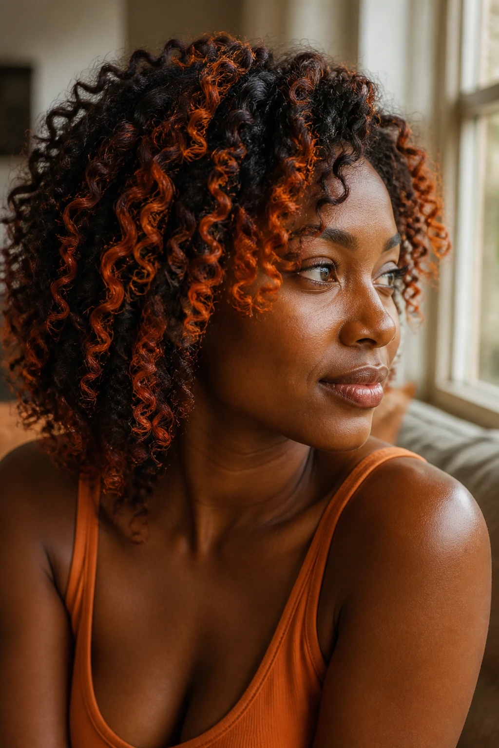
Tangerine flame ribbons are bright, fiery, and not for the faint of heart. They bring orange-red energy to deep skin in a way that can look electric when the hair is healthy and the color is saturated enough.
A weak tangerine is a bad idea. It can slide into brass. A strong tangerine, though, can look like polished fire. That’s why the ribbons should be painted with enough saturation to hold their own against the base. Curly hair helps because the orange appears in pieces instead of one hard strip.
This shade is especially good if your undertone is warm or golden. It also loves movement. Every coil bend throws the color in a slightly different direction, so the hair looks brighter the moment you turn your head. If you want attention, this is one of the most direct paths to it. If you want subtlety, skip it. No shame in that.
22. Ruby Halo Highlights
Ruby halo highlights sit around the perimeter of the curls and give the hair a warm red glow that can look gorgeous against deep skin. Ruby is bolder than burgundy, but cleaner than cherry red. That makes it a strong choice for people who want red with a little discipline.
The halo placement matters because it frames the face and the silhouette at once. On curly hair, a halo of ruby can appear almost like a lit edge when the curls are defined. It also works well with updos, which is useful if you like changing the style shape without changing the color story.
This is not the shade to hide in the back of the head. Put it where the light can touch it. If the hair is thick, the halo can be just one ring around the outer section. If the texture is finer, make the ribbons a little heavier so they do not disappear. Ruby has presence, and deep skin can wear that presence beautifully.
23. Honey Blonde Money Piece
A honey blonde money piece is the loudest kind of face frame, and it works because the warmth keeps it from looking icy or detached from deep skin. The front pieces lift the face, brighten glasses or makeup, and give curls a clear focal point.
This is a high-maintenance look. Straight up. The lighter the money piece, the more toner and moisture it will need. But if you’re the kind of person who likes the front of the hair to do some talking, it’s worth it. The rest of the hair can stay dark and rich, which keeps the contrast from feeling unfinished.
On curly hair, the honey blonde looks better when the front pieces are painted with some softness at the root. Hard lines near the part are a fast route to a stripey look. Keep the placement feathered, let the curls separate, and the money piece will read as bright without looking pasted on.
24. Sand Beige Ribbons
Sand beige ribbons are for people who want contrast without a lot of warmth. The color is softer and more muted than honey or caramel, so it can look clean and modern on deep skin when the toner stays creamy instead of chalky.
This one is tricky in a different way from copper. Beige can go flat fast. To keep it from looking dull, the ribbons need enough brightness to show against the base, but not so much that they lose all softness. On curls, the sand tone works best in fine threads through the crown and sides, where the movement keeps it from reading blocky.
I’d recommend this shade only if you like a quieter finish and don’t mind toner maintenance. It’s a taste thing. Some people want warm glow. Others want a cooler, smoky lightness. Sand beige is the second group’s color. If the formula is good, it looks expensive. If it’s off by even a little, it can look tired. That’s the gamble.
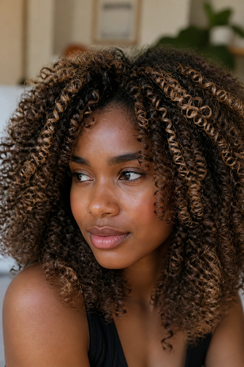
25. Espresso and Honey Contrast
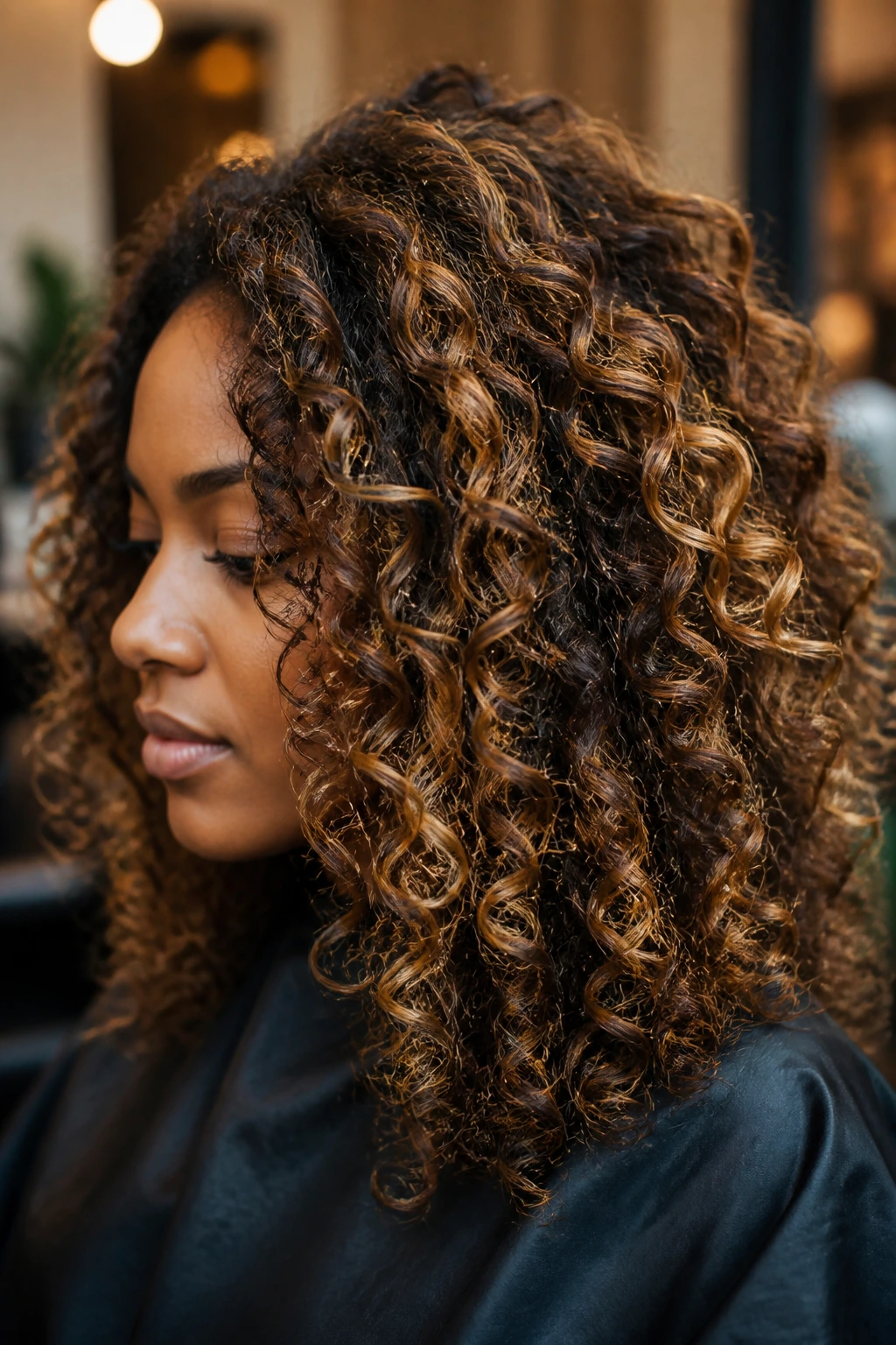
Espresso and honey contrast is the full dimensional answer: dark lowlight richness on one side, honey-bright ribbons on the other, all woven through curls so the hair has depth from root to tip. It’s not one note. That’s the whole point.
This is the look I’d pick for someone who wants highlights but refuses to give up shadow. The honey keeps the hair lively, while the espresso lowlights stop the whole thing from floating into a single flat color. Curly hair loves this kind of contrast because each bend has something different to show. One coil catches the light. The next one keeps the depth. That back-and-forth is what makes it look expensive.
If you’re going to ask for one thing from a colorist, ask for dimension, not just brightness. It’s the difference between hair that looks colored and hair that looks styled even when you haven’t done much to it. This is the one that makes the pattern itself part of the color story.
Why Curly Texture Changes the Way Highlights Read
Curly hair and highlights have a weird little relationship. Straight hair shows you the whole color all at once; curls break it into surfaces, shadows, and edges. That means the same caramel ribbon can look softer on a coil than on a flat blowout, and a sapphire panel can disappear until the hair swings the right way.
That’s good news, but it also means placement matters more than most people expect. A highlight painted on the underside of a loose curl may barely show until the hair is flipped or stretched. A chunk placed too wide on a tight curl can turn into a stripe because the bend of the curl keeps exposing the full width of the color. Narrower sections usually win here. So do softer blends.
Deep skin tones change the math, too. Warm highlights tend to echo the golden, red, or bronze cast many melanin-rich complexions already carry. Cool tones can look stunning, but they need enough saturation to avoid looking dusty. And very light blondes need a cleaner toner than most people realize, or they start to read as beige in a bad way rather than bright in a good one.
Shrinkage is the sneaky part. A color that looks bold on wet hair may calm down after drying, which is why colorists often paint curls with the final shape in mind rather than the stretched length alone. If you wear your hair both stretched and shrunken, tell them that. It changes where the light should land.
What to Bring to the Color Chair
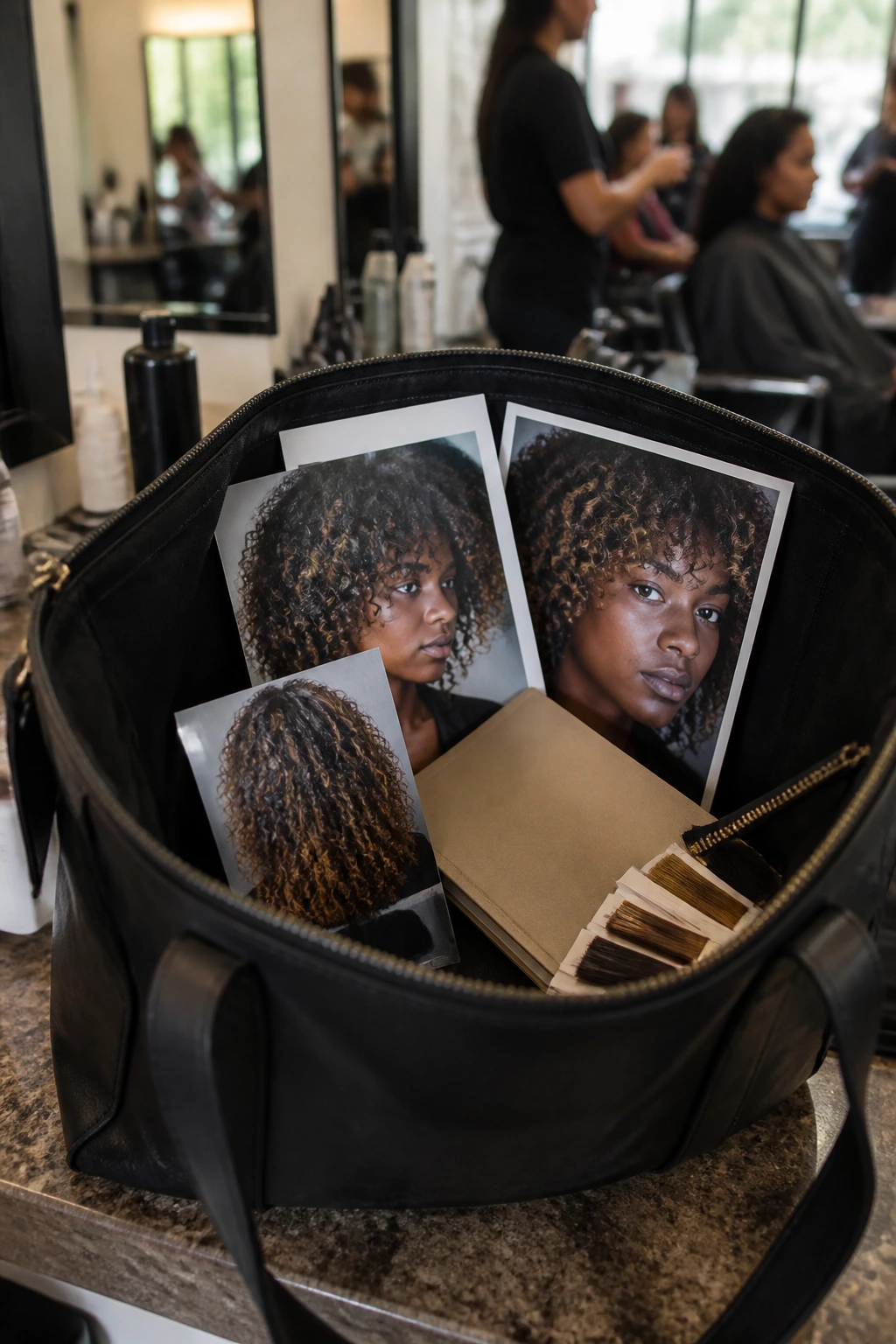
A good highlight appointment starts before the cape goes on. Bring photos of the color in natural light, not just in salon lighting or filtered selfies. Those polished shots hide the real tone, and tone is the whole game here.
A few things belong in your bag or notes app:
- Two or three reference photos of the exact shade family you want, taken in daylight.
- A photo of your hair dry and styled the way you wear it most often.
- Your color history if you’ve ever had relaxer, henna, box dye, bleach, or a keratin treatment.
- Your maintenance tolerance in plain language: low, medium, or high.
- The styling tools you actually use at home, especially if you diffuse, stretch, or twist out regularly.
If you already know your curls hate too much overlap, say that. If your ends are thirsty, say that too. A colorist can work around honest information. They cannot work around “do whatever” and hope for the best. That phrase has caused more bad highlight jobs than bad chemistry ever has.
Picking the Right Shade Family for Your Undertone
Warm undertones usually love caramel, bronze, copper, amber, honey, and auburn. Those shades echo the skin rather than fighting it, which is why they can look rich even when the lift is moderate. If your skin has a gold, red-brown, or peach cast, these are safe starting points.
Cool undertones tend to hold plum, mulberry, violet smoke, sapphire, and smoky silver better. That doesn’t mean warm shades are off limits. It means the cool tones often need less warming help from makeup or lighting to feel balanced. If your skin has a blue-red or neutral-brown cast, a smoked berry or jewel tone can look especially sharp.
Neutral undertones have the most room to play, which is either freeing or dangerous, depending on your taste. You can go warm, cool, or vivid, but the one thing to avoid is a tone that lands halfway between choices and ends up muddy. Beige is the prime suspect here. Beige needs purpose. Without it, it just sits there.
Here’s my blunt opinion: the shade should look like it belongs to the same family as your skin, not the same exact color. You want kinship, not camouflage.
Essential Tools and Products for Highlighted Curls
Color is only half the story. The other half is keeping the curl pattern alive enough to show it off.
- Color-safe sulfate-free cleanser: Helps keep toner and semi-permanent color from slipping out too fast.
- Deep conditioner or hair mask: Dry highlighted curls need weekly moisture, especially after lightening.
- Bond-building treatment: Useful before and after bleach sessions to keep the hair from getting gummy or brittle.
- Wide-tooth comb or curl pick: Lets you detangle without tearing through highlighted strands.
- Microfiber towel or cotton T-shirt: Cuts down on frizz while curls set and dry.
- Diffuser attachment: Great if you want the highlight ribbons to separate instead of drying into one puff.
- Satin bonnet or pillowcase: Protects the cuticle overnight and slows fade from friction.
- Gloss or toner: Useful for refreshing warm bronze, caramel, or blonde shades between color appointments.
The one thing people skip and later regret is the bond care. Lightening curly hair already asks a lot. Give it backup.
How to Style These Highlights So the Color Actually Shows
Wash-Day Definition: Use a leave-in and a curl cream or gel that gives the curls enough separation to show ribbon placement. If the whole head dries into one fluffy cloud, the highlight work disappears.
Stretch and Shape: A diffused blow-dry on low heat, a banding method, or a stretched braid-out can help longer highlights show more clearly. Tight coils can hide lighter pieces in the interior, so a little stretch often helps the shape read better.
Lighting: Side light and daylight reveal these colors better than flat bathroom lighting. If you want to see whether the tone is working, stand near a window and turn your head. That simple move tells the truth fast.
Accessories: Gold hoops, bronze makeup, plum lipstick, or a deep green shirt can pull the hair color forward. I’m not saying match everything. I am saying the right frame makes the highlights look intentional instead of incidental.
A small parting change can also change the whole look. That’s a curly-hair trick I never get tired of.
Keeping Highlighted Curls Fresh Between Salon Visits
Highlighted curls need a little more patience than virgin hair, but they don’t need babysitting every day. The main rule is to keep the cuticle smooth and the moisture balanced, because dry curls make color look dull fast.
Wash about once or twice a week if your scalp likes that rhythm, and lean on a color-safe cleanser rather than a stripping shampoo. If you’ve got blonde, beige, or silver pieces, a toner or gloss every 4 to 8 weeks usually keeps brass in check. Warm shades like caramel, copper, and bronze can often go a little longer with just glossing and deep conditioning.
Once a week, use a mask that leaves the hair soft but not mushy. If the curls start stretching too far or feeling gummy, you may need a protein step, not more moisture. That part gets ignored a lot. People keep pouring conditioner on hair that actually needs strength.
At night, use satin. Always. Bonnet, scarf, pillowcase—pick your weapon. Friction flattens highlights and roughs up the tone at the same time. If you do sleep on cotton, the color will still be there, but the shine will start looking tired.
Extra Tips and Color Boosters
Placement: Put the brightest color on the outer canopy, face frame, and crown if you want the highlight to show without making the whole head lighter. On tight curls, that outer layer is the billboard.
Customization: Ask for a shadow root when you want lower upkeep, or a color melt when you want the shade to blend from dark to bright. Peekaboo panels work well if you like vivid color but need it hidden for part of the week.
Serving Suggestions: Pair warm highlights with gold jewelry, bronzy makeup, or a deep berry lip. Pair cool highlights with silver hoops, plum gloss, or a crisp black top. The hair does not need matching, but it does benefit from a little visual echo.
Make-It-Yours: If you’re gentle on bleach, lean into caramel, bronze, mahogany, or auburn. If you’re chasing a bolder mood, the sapphire, teal, emerald, or violet looks can be tucked under the top layer so they stay dramatic instead of overwhelming.
A gloss is often the cheapest upgrade in the room. It gives the highlights a cleaner finish than another round of lightening.
Common Mistakes That Flatten the Color
Going too pale too fast: A level 10 blonde on deep curly hair can look harsh if the toner is off by even a little. The fix is to start one or two levels deeper and build up in stages.
Ignoring undertone: Yellow-beige highlights on warm skin can turn muddy, while copper on cool skin can feel too hot. The fix is to match the warmth or coolness of the color to the undertone already sitting in the face and neck.
Painting highlights too wide: Thick stripes may look fine on a straight swatch, then turn into obvious bars on curls. The fix is finer sections, softer blends, and curl-aware placement around the bends.
Overprocessing the hair: Dry, stretched ends and loss of curl shape are the warning signs. The fix is fewer overlapping foils, shorter lift sessions, and a real bond-building plan.
Skipping maintenance: Brass, fade, and rough ends will chew up even a beautiful color. The fix is toner or gloss on schedule, not random touch-ups when the mood strikes.
Forgetting the style you actually wear: A highlight map made for blown-out hair can disappear once the curls shrink. The fix is to show your stylist the hair as you normally live in it.
Variations and Alternative Ways to Wear the Color
The Face-Frame Starter: Keep the color only around the front pieces and a few crown ribbons. This is the easiest way to test a brighter tone without committing to a full head.
The Peekaboo Party: Hide teal, sapphire, cherry cola, or emerald under the top layer. It’s a strong option if you want color that shows up in motion or updos.
The Soft Melt: Blend caramel into bronze, then into a deeper root. This gives you a soft grow-out and makes the curls look thicker.
The Full Jewel Box: Mix plum, burgundy, sapphire, and emerald in separate panels for a richer, more fashion-forward result. Keep the shades deep enough that they don’t fight each other.
The Barely-There Glow: Use mahogany, toffee, or chestnut gold in thin veils through the top. It’s ideal if you want movement but not a major color change.
The Contrast Cut: Pair espresso lowlights with one brighter highlight shade. This is the one that makes curls look dense and sculpted instead of flat.
Frequently Asked Questions
Which highlight color is easiest to maintain on deep skin and curly hair?
Warm caramel, bronze, chestnut gold, and mahogany are usually the easiest because they grow out softly and don’t depend on perfect toner every few washes. They also hide dryness better than pale blonde or silver.
Can deep skin tones wear blonde highlights?
Yes, but the blonde needs to be chosen carefully. Honey blonde, champagne beige, and soft beige ribbons tend to work better than icy platinum because they keep some warmth and don’t look disconnected from the skin.
Do curly hair highlights need foil or balayage?
Both can work. Foils give more lift and control, while balayage gives softer, painted placement that often looks better on curls because it follows the shape of the coil instead of boxing it in.
How light should highlights be on very dark hair?
Usually one to three levels lighter for subtle dimension, or more if you want a visible copper, blonde, or vivid fashion color. Going too light too fast can make the hair look striped and can push the curl pattern into dryness.
Will highlights ruin my curl pattern?
They can if the hair is overprocessed, but they do not have to. Bond care, spacing out appointments, and avoiding repeated overlap on already-lightened sections go a long way.
What if the highlight turns orange or brassy?
That usually means the hair lifted warm and needs a better toner, gloss, or color adjustment. Copper is intentional; brass is accidental. The difference is depth and shine.
How do I keep vivid colors like teal or sapphire from fading fast?
Wash less often, use cool water when you can tolerate it, and keep the shampoo focused on the scalp rather than the lengths. A color-depositing conditioner can also help between salon visits.
Can tight coils wear highlights without losing definition?
Yes, and they often look fantastic with the right placement. Thin ribbons on the outer curve of the curl cluster usually preserve definition better than chunky panels buried in the middle of the hair.
Let the Curls Carry the Color
Highlights on deep skin tones with curly hair work best when they act like part of the curl pattern, not something pasted on top of it. The colors that last in memory are the ones that respect the base—warm caramel, copper, mahogany, plum, sapphire, teal, all of them. None of them need to be timid, but they do need good placement and a shade family that makes sense next to the skin.
The smartest move is usually not the brightest one. It’s the one that gives the curls depth when they shrink, shine when they swing, and enough contrast to stay interesting a month later. That’s the real test.
Pick the tone that matches the way you wear your hair most, then give it a little room to move. Curly hair does the rest.